Hotel Spec editor Can Faik discovers what lies beneath Viceroy Chicago’s clever and cultured design...
On the face of it, Viceroy’s first offering in the Midwest is a luxury hotel that gives a humble nod to its revered past, but delve a little deeper and you’ll find more than just elegant aesthetics. Hotel Spec editor Can Faik discovers what lies beneath Viceroy Chicago’s clever and cultured design...
Opening the doors to the Midwest for Viceroy, was the unveiling of the brand’s Icon Collection Chicago hotel.
Set in the heart of the city, the hotel sits comfortably on the corner of Cedar and State Street on the plot that was once home to the historic Cedar Hotel, and plays homage to its surroundings with sweeping views of Lake Michigan and Chicago’s beautiful city skyline. From its inception, prior to floorplans even being drafted, the Viceroy Chicago’s aim was to be a building with a dynamic presence, but to also be an elegant addition to the cityscape – something the finished exterior has achieved remarkably well, with its original brick and terracotta façade mixed with the contemporary sky-reflecting mirrored glass that towers above it.
It feels like a meeting of two minds, which rings true, given the original features first designed by architects Rissman and Hirschfield working so well with the new structure thought up by leading architects, Goettsch Partners. In fact, the whole project, inside and out, was a huge collaboration with the likes of Chicago-based Convexity Properties, Todd-Avery Lenahan Founder and Principal of award-winning TAL Studio, and The Gettys Group procurement team to bring the hotel to life. The result is a thoughtfully curated design, complete with artistic and historic infusions, which sits perfectly in sync with its Chicago locale.
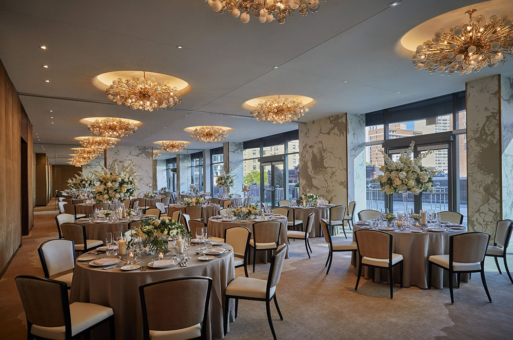
180 generous rooms are laid out over the 18-storey urban resort, which also offers a rooftop pool and famed Boka restaurant. The glassy façade brings stunning views from floor to ceiling windows throughout the building, as well as flooding the interior space with natural light and reflecting its surroundings from the outside.
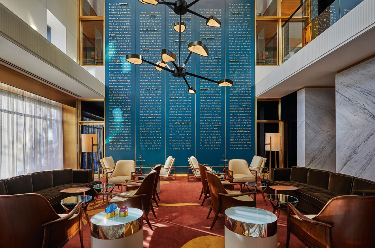
The inspiration for the hotel came from the Flâneur, a French literary figure known for its free spirit and eye for exploration; a character that Todd-Avery Lenahan used to come up with his custom design of the interior space as a guide to create details that would delight and inspire guests. The hotel’s public spaces largely focus on bold art fixtures, one of which is a 30-foot poem wall, inscribed with quotes from French poet Marcel Proust, fashioned to be a talking point that stands proudly in the lobby’s living room area. Custom designed for Viceroy Chicago, the tableau is a unique art installation that complements rather than dominates the lobby area and sits well in its rich teal and bronze surroundings, particularly when it’s lit-up each evening.
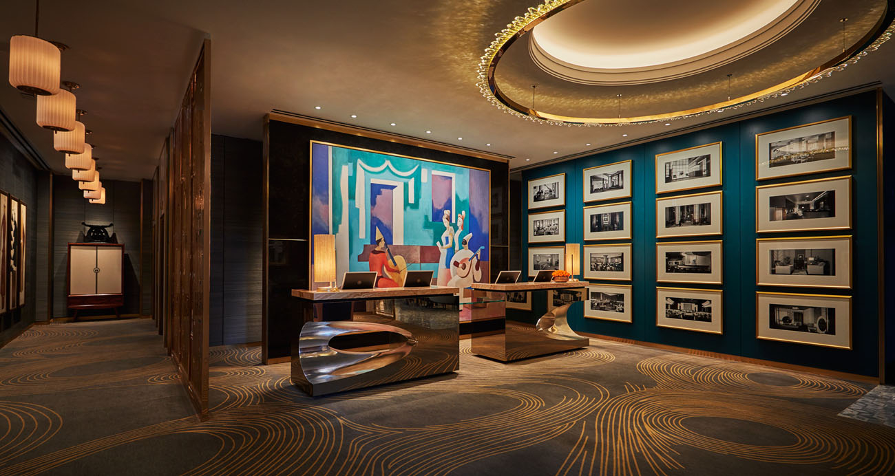
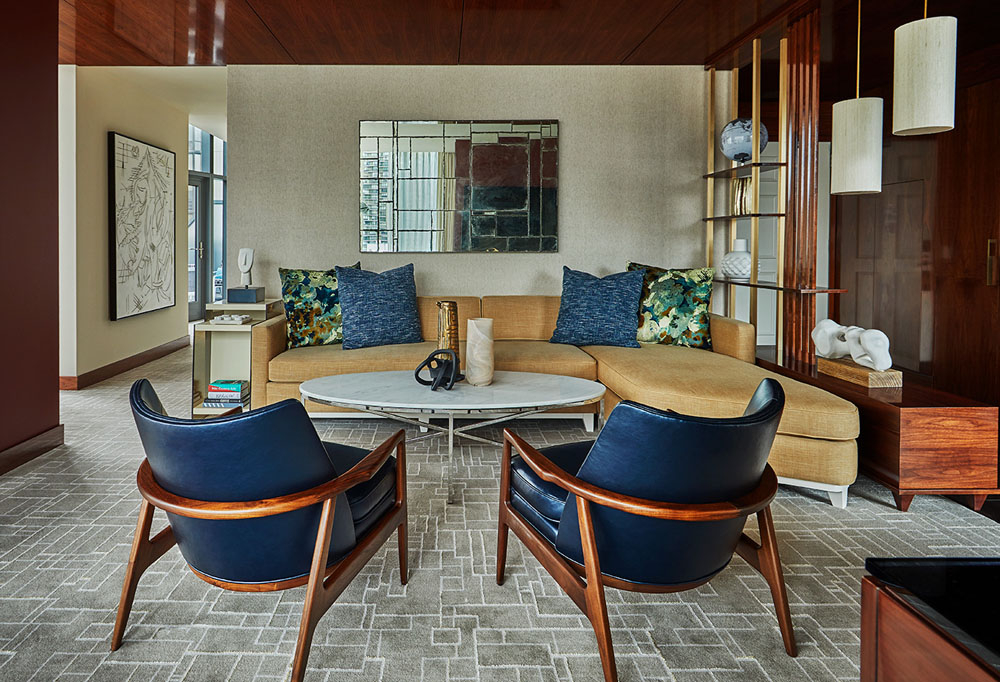
The lobby is an elegant mix of warm lighting, mid-century style furniture, straight lines, and bright artwork, including a large painting that depicts a Venetian carnival music recital by South American cubist painter Badi that sits behind marble-topped sculpted bronze reception desks, opposite which a beautifully framed fireplace gives the feel of homeliness, despite the hotel’s luxury look. Designer Todd-Avery Lenahan calls the lobby area ‘an intelligent social space in an intelligent city’, and he’s right.
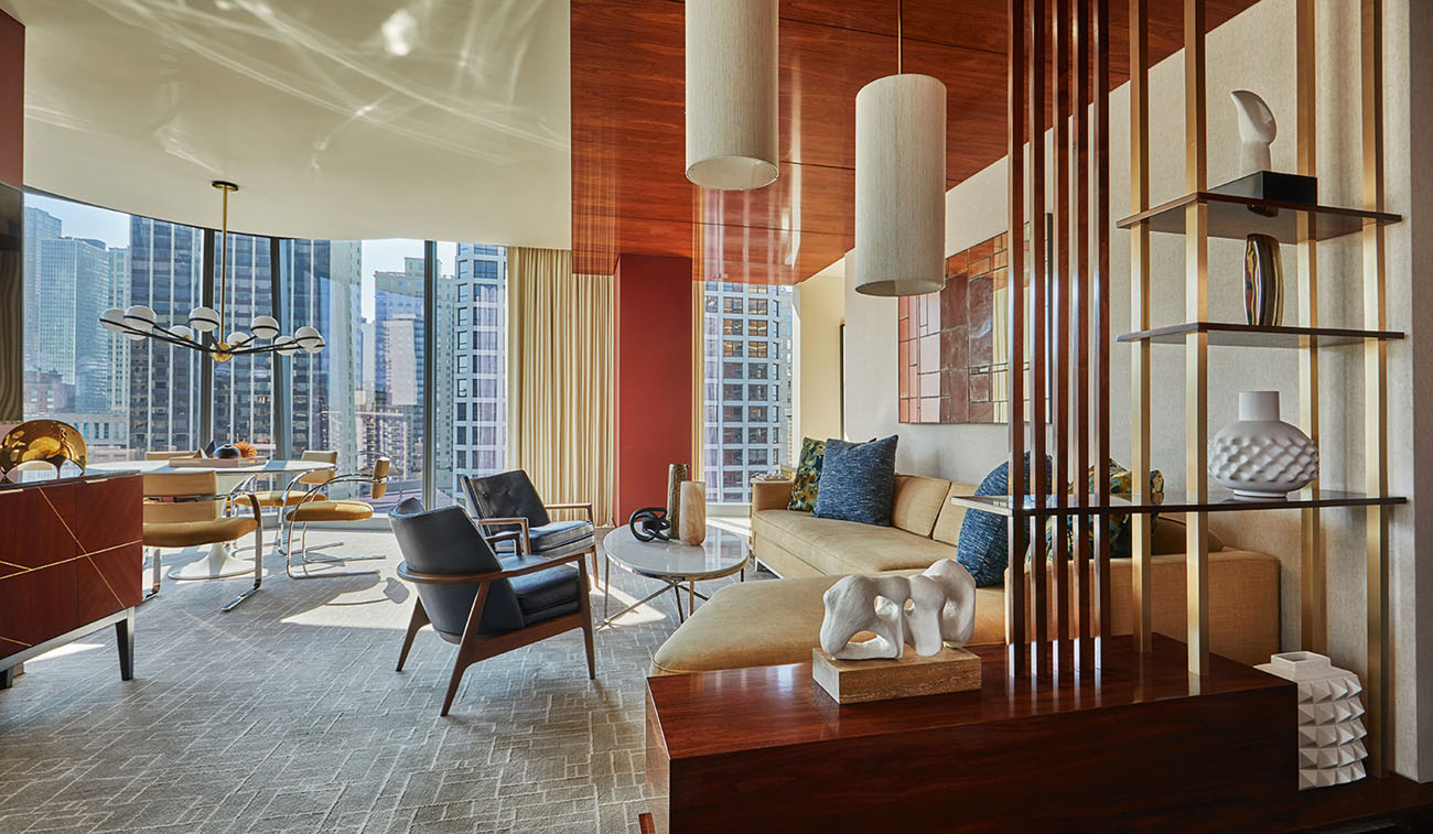
Lenahan used the Aristotle quote: “the whole is greater than the sum of its parts” as his inspiration for the deconstruction of the Venetian Carnival painting’s rich and varied pigments, which he then used as separate blocks of colour throughout the building. The designer has also taken inspiration from modern sculptures by artists including Calder, Picasso, Miro, and Kapoor that are found throughout the city’s urban landscape to create interesting forms and shapes for what would otherwise be very conventional and functional pieces of furniture.
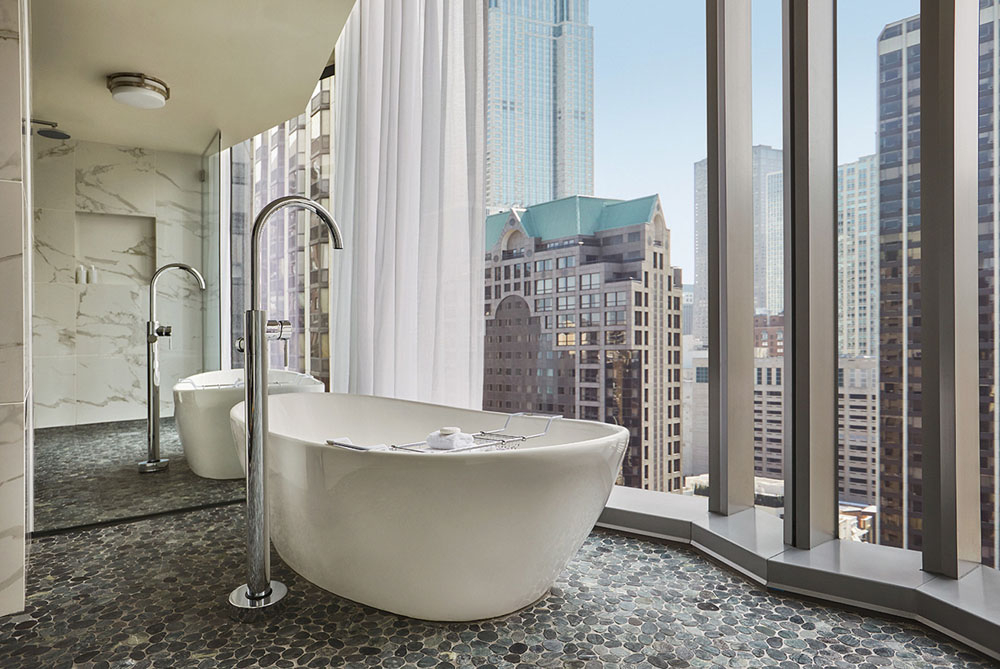
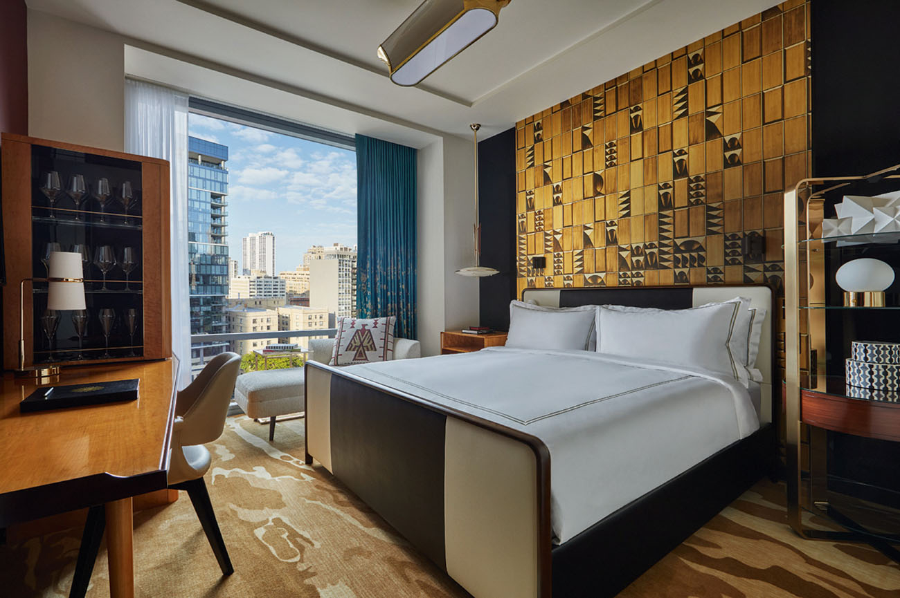
Guestrooms feature a distinct headboard-wall that displays a digital reproduction of an original work produced by London artist Tim Modus. Inspired by the architectural elements and sculptural forms of the mid-century, the artwork serves as a nod to Chicago’s own architectural history, which ties in beautifully with the overall design concept. As well as enlarged, luxurious bathrooms and closets, guestrooms feature cubist reproductions of Miette Brave’s artworks, and a selection of suites offer expansive terraces with incredible views of the cityscape and Lake Michigan – a living artwork in itself.
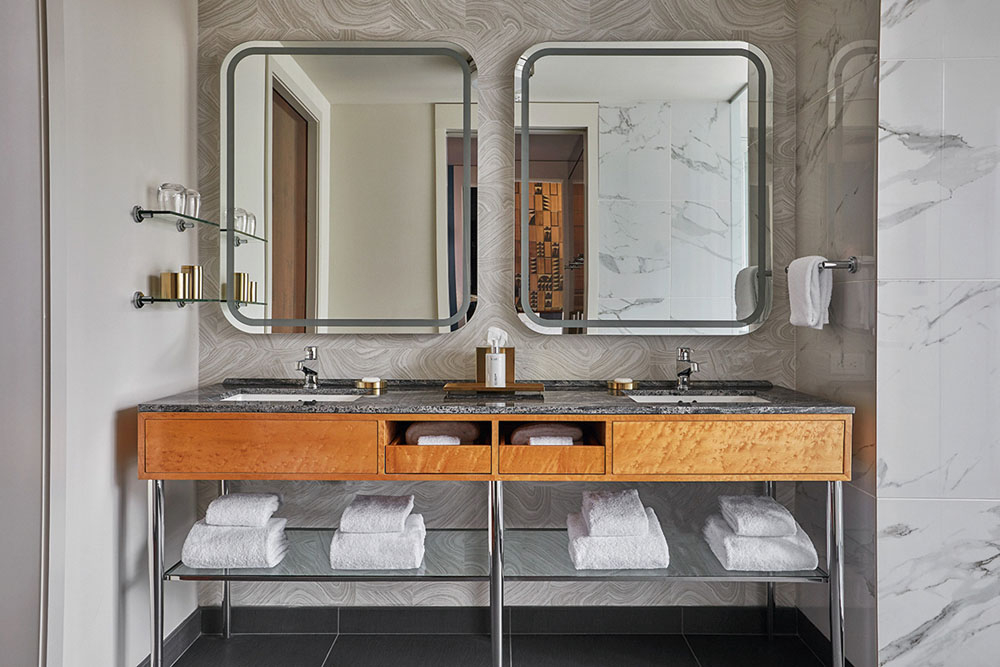
Step into any number of guestroom bathrooms and you’ll realise the emphasis on space and luxury. Clean lines are generously laid out in the form of large basins set in marble-topped units, huge angular bathtubs, and bronze cabinets framed by well lit mirrors and a number of bronze bathroom accessories.
From the outset, the Viceroy Chicago appears to be a well-presented luxury accommodation that has both honoured its past whilst looking to the future, but on second, third, and fourth glance, because you can’t help but keep going back for more, you begin to notice just how much culture and relevance the design holds here, from even the smallest of aspects – the devil is in the detail.

Founder and Principal of TAL-Studio, Todd-Avery Lenahan speaks to Hotel Spec editor Can Faik about Viceroy Chicago...
What makes Viceroy Chicago stand out?
Viceroy Chicago sets itself apart with its spirited design character that unfolds synergistically through memorable thoughtfully curated world class design, art, style, and culture towering over the living room with colorful graphic bravado while simultaneously becoming quietly elegant in its precise shimmering presentation of thousands of words from the French novelist that are being contemplated by each view on his or her own terms. Dramatically lit up each evening, the Poem Wall Proust tableau has been filling the living room with conversations that emanate from its plane without ever a word spoken. The collection of works is not a singular poem or essay, rather I designed and curated it to be an engaging and provocative work that inspires repeat exploration and introspection on both an individual and collective level among guests such that the power of brilliantly composed. This monumental towering wall is a respite that guests, tourists and locals are visiting and are left with a reflective silent exhale of meaningful inspirational philosophies.
How would you describe the overall interior design?
The overall interior design plans were one-of-a-kind, done with great detail, precision and with the highest quality. They are an infusion of curated design, art, style and culture that create an authentic, inspired and dynamic experience for guests. The many dimensions and nuances of the interiors were unveiled in my first concept presentation of the hotel.
How have you incorporated art into the lobby of the hotel?
Lobby art: “Bold art fixtures sit nearby this central art installation in the lobby living room with inscribed provocative quotes from the poet. The monumental scale tableau is executed in a deeply saturated teal with a chroma that is both commanding and transfixing to its viewers. It is dramatically lit up each night filled with a collection of his works and insightful words. Just beyond the living room, large bronze reception desks welcome guests. Aristotle’s quote “the whole is greater than the sum of its parts” was my inspiration for the deconstruction of the painting’s extraordinary pigments and featuring them as blocks of color unto themselves throughout the property. A large painting behind reception desk: Enlargement of South American cubist painter “Badi” depicting a Venetian carnival music recital. I chose to elevate the impact of the cubist painting’s extraordinary color blending by employing its complex colors in the lobby and throughout the property to be discovered after first seeing the painting in its totality.
How important are public spaces in a hotel?
I call the lobby area an intelligent social space in an intelligent city. Mid-century inspired furnishings recall an iconic, endearing and enduring period of Chicago’s architectural history.
What are your highlights from the guest rooms?
Guest rooms host enlarged, luxurious bathrooms and closets, and a selection of suites that offer expansive terraces with incredible views of the cityscape and Lake Michigan. Cubist figural artwork in the guest rooms are reproductions of cubist artist Miette Brave. Rooms feature a distinct headboard-wall that is a digital reproduction of an original work produced by London artist Tim Modus. The display is inspired by the architectural elements and sculptural is a digital reproduction of an original work produced by Modus. The original work by Modus was inspired by architectural elements and sculptural forms of the mid-century, specifically the 1960’s. I incorporated the Belsize reproduction into the room design’s for the Viceroy Chicago as a reference to the city’s storied architectural history which in the 60’s witnessed the creation of the many of the world’s most renowned icons of modern architecture that further cemented Chicago’s legacy as of one of the world’s most architecturally important cities forms of the mid-century, and will serve as a nodto Chicago’s storied architectural history.
How would you describe the colour scheme used within the hotel?
In the property, a range of colors and hues are intended to be viewed in the manner of observing paints on an artist’s palette that while not yet incorporated into a painting on canvas, are “the parts” in isolation that when considered collectively throughout the building’s interior are appreciated even more powerfully when seen manifested together in the major cubist paining behind the reception desk.
Tell us about one of your favourite design features in Viceroy Chicago
Lounge chairs in the guest rooms; are quite special and created with great inspiration. They are doubled-sided with two iconic images from the Indians that populated the Central Great Lakes Region and the Chicago area. I describe the pillows primitive aesthetic as capturing my often iconic interplay of modernity juxtaposed with the ancient and primitive.
TAL Studio

